An art test for a mid-level UI Artist position. I was successful in my application, but unfortunately the role had to be closed before I could start! Still, I enjoyed having the opportunity to meet the team, show my skills, and receive feedback on my work.
The Brief
Create a pause/map screen for Alpha Raiders, a future-fantasy third person shooter with elements of archaeology and the occult. You need to create and arrange the following elements:
MENU OPTIONS:
Go to Settings
Reload Last Checkpoint
Save Game
Go to Photo Mode
Expand Map
Exit Game
INFORMATION:
Mission Objective
Difficulty
Map (cannot be manipulated)
4 Map icons:
current position, objective waypoint,
vendor, weapon upgrades
current position, objective waypoint,
vendor, weapon upgrades
Button Prompts
Current Equipped Weapon
Research
MOODBOARDS
Keeping in mind the style notes provided in the brief, I took to Google, Pinterest, and the Game UI Database to find inspiration. I mainly wanted to see how other games in similar genres handled their maps and pause screens, and I made a huge moodboard which I'll spare you from looking at.
I then narrowed down the games that I wanted to draw influence from and created a slightly neater moodboard. Not wanting to limit myself to games, I also investigated how similar UI was done in films and TV.
I found some really cool stuff in the NASA brand guidelines, and much of my early exploration was based on their Artemis branding.
I found some really cool stuff in the NASA brand guidelines, and much of my early exploration was based on their Artemis branding.
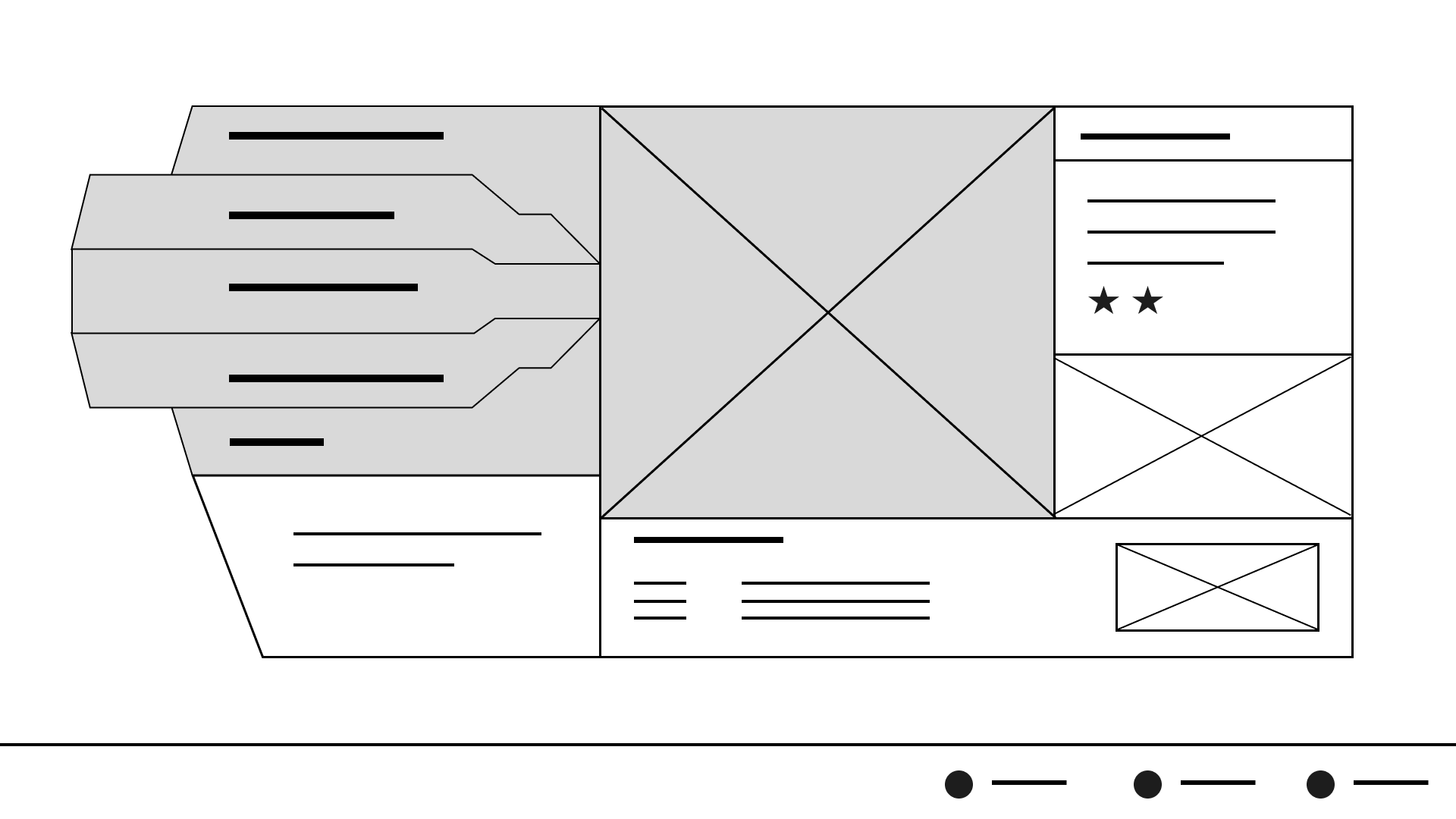
Paper Wireframes
With my inspiration narrowed down I set about sketching some paper wireframes.
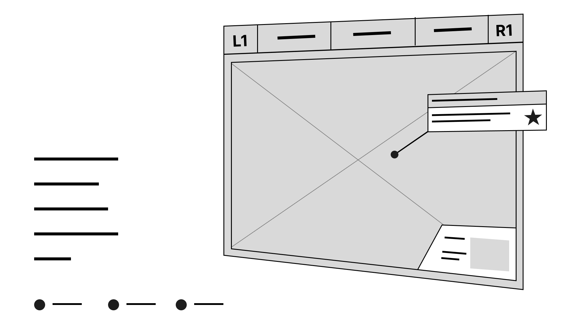
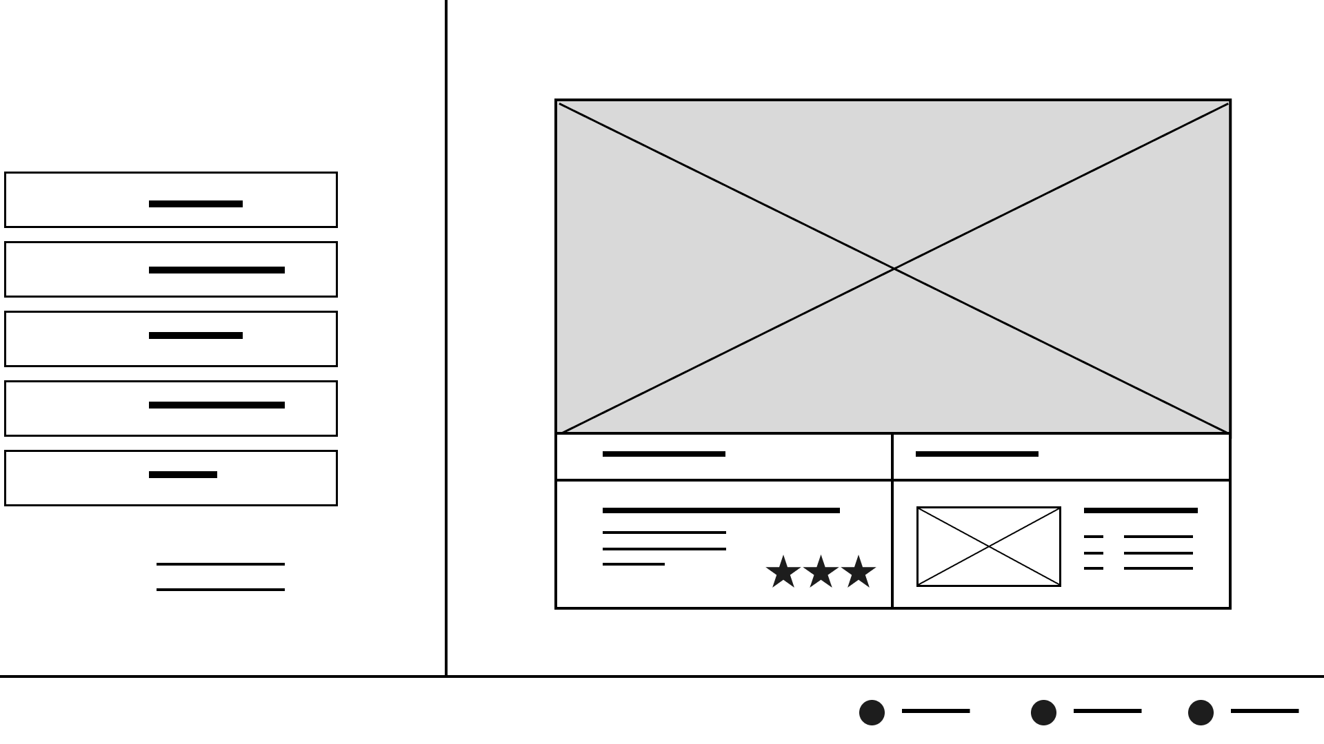
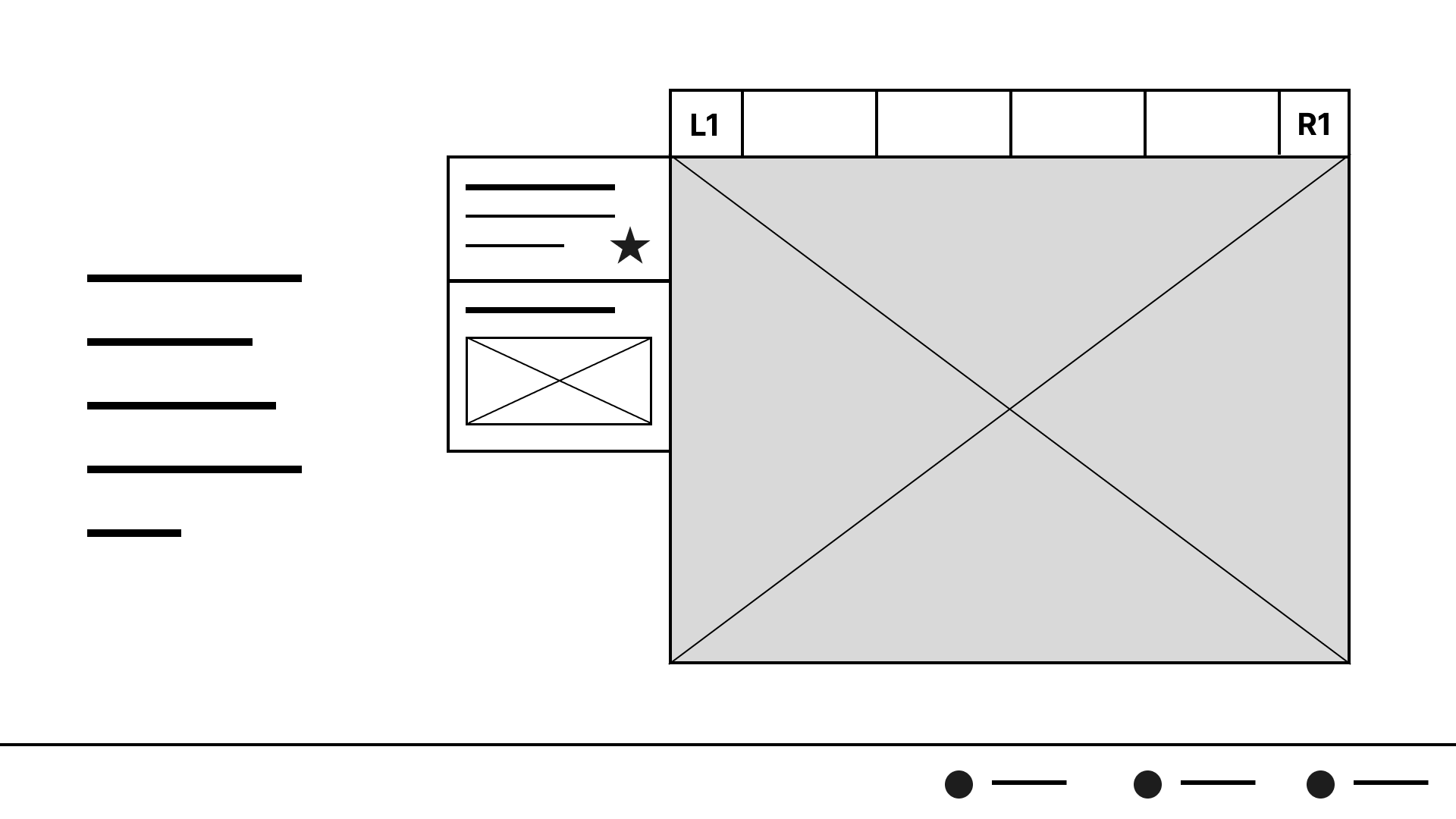
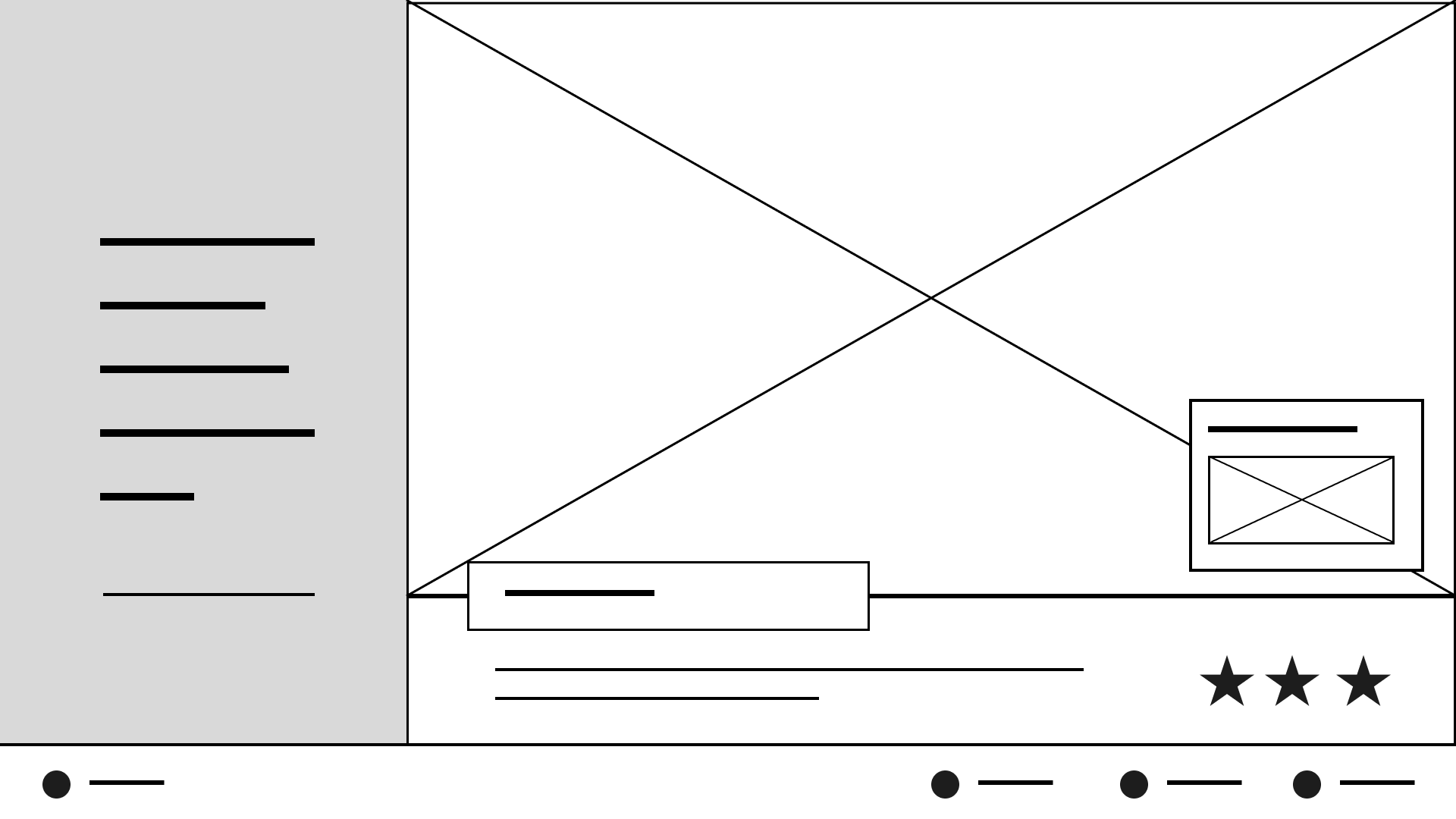
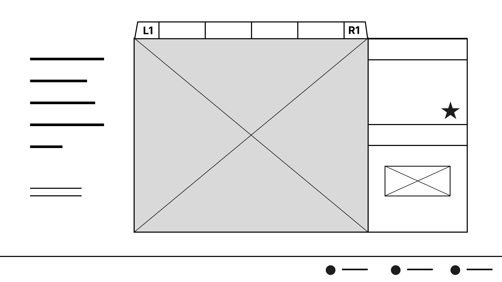
The biggest challenge for me was realising I had a lot of information to show on-screen at once. I had to think about how to fit it all in without overwhelming or confusing the user.
Digital Wireframes (Created in Figma)
Style Exploration
Experimenting with colours and textures to see what ideas I could generate in a short amount of time.
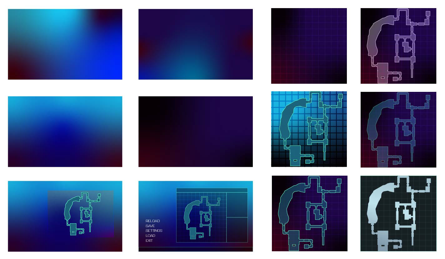
Initial colour exploration, considering the idea of glassmorphism.
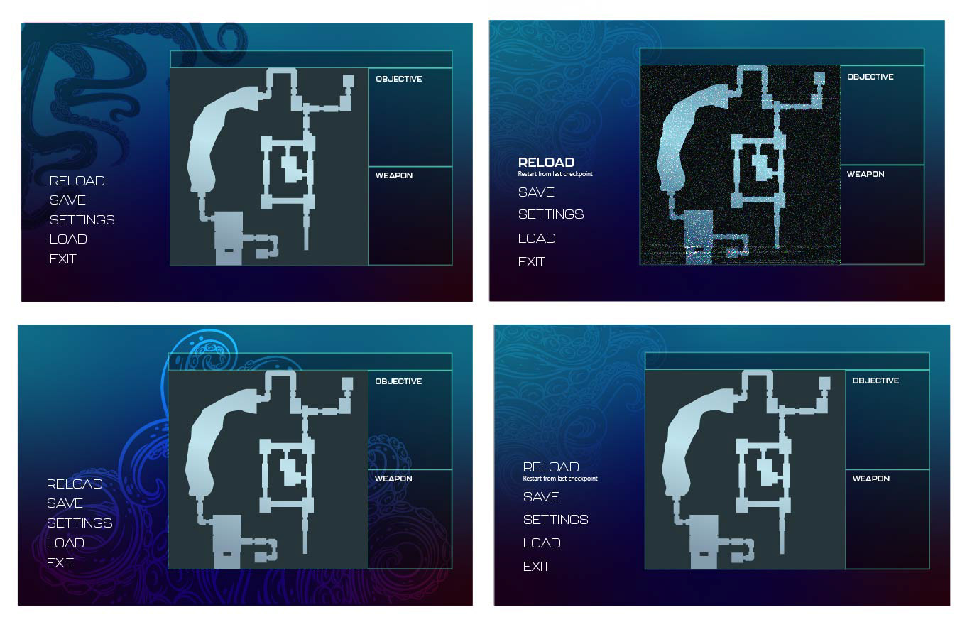
Experimenting with ways to include occult elements. Really didn't like it.
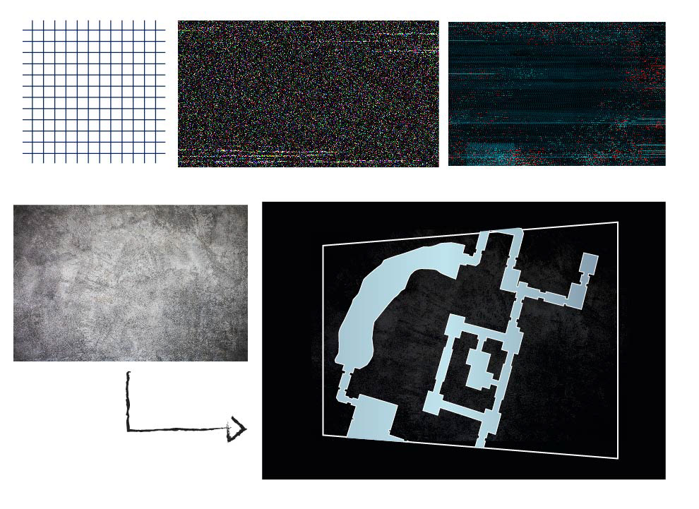
Experimenting with textures to see what effects I could generate and finally landed on a map design.
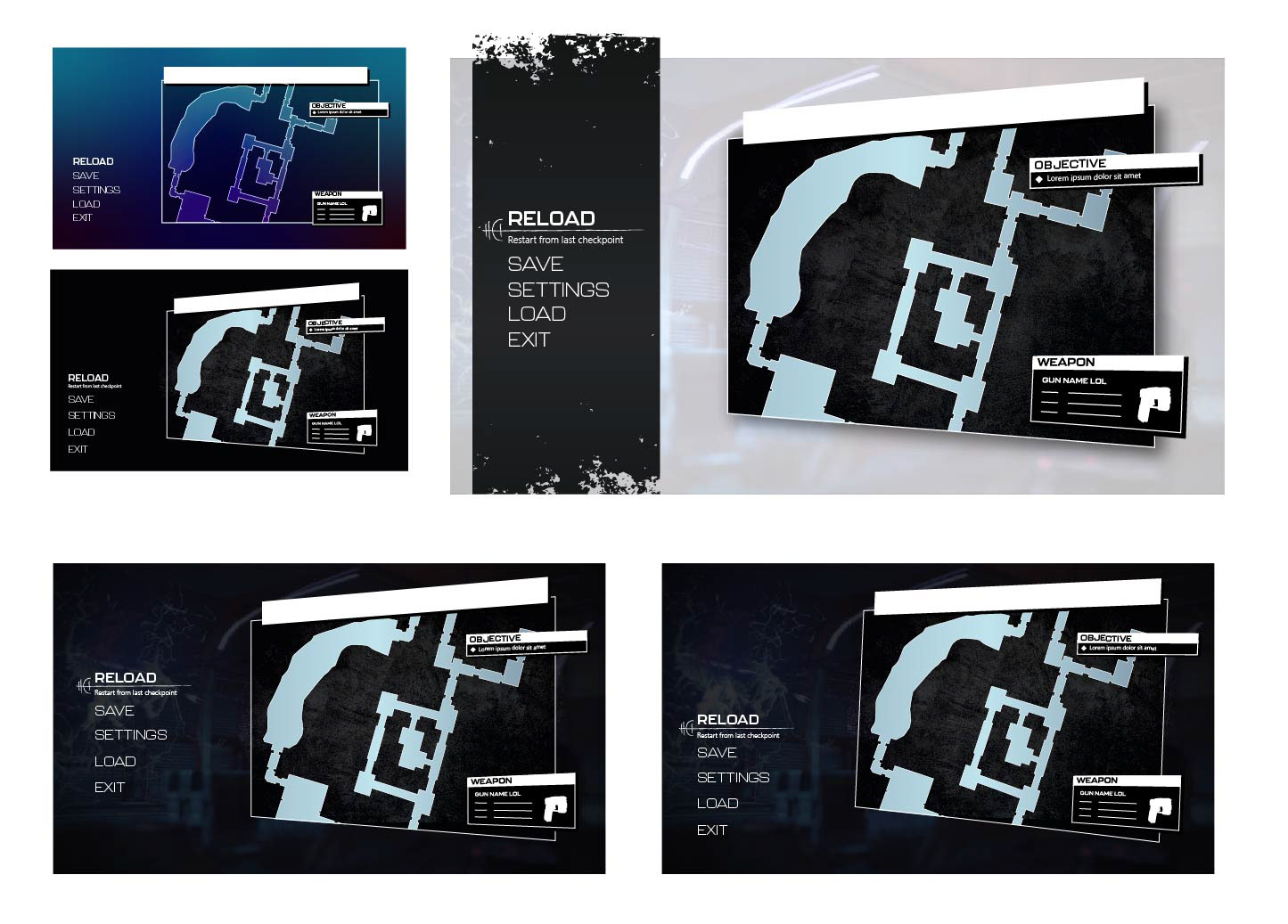
Developing my screen from the map design. Moving towards the floating style.
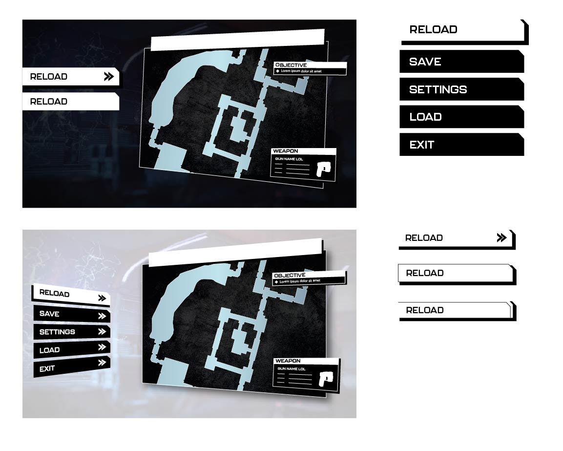
Quick experiments with button styles.
Initial Design & Feedback
- The player's location doesn't have quite enough contrast, and can get lost at a cursory glance. It could do with being either a different colour or shape to differentiate it further from the area markers.
- I love the alien language-inspired pattern on the left side of the screen, but there's a visual disconnect between it and the sharp diamond shapes used in the map heading.
- The right-side of the screen feels very clean compared to the left, so there's a bit of disconnect going on. All of these elements look great individually and have been executed well, but don't quite come together as a whole.
- As the map design is scrolling off-screen, the player's location should be at the centre of the window.
- Expand Map is included as a button prompt rather than a menu item (fantastic!), but may have benefitted from being closer to the map itself rather than hidden in a row of options. But this is being picky.
Final Design
Icons
- Incorporated bright green for an eerie, glowing feel. This colour is used as an accent throughout the screen.
- Black background ensures the icons are visible no matter where they’re placed on the map, with sufficient contrast.
- Icons are intentionally imperfect for a rougher, grungier feel. I created pixel-perfect icons, then used a combination of Illustrator's Roughen effect and moving anchor points by hand in order to give them a more hand-made feel.
- The Objective Waypoint and Player Location icons are orange to help differentiate them at a glance.
Accessibility Considerations
All text adheres to WCAG contrast standards at AAA level.
Text exceeds 52px at 4K resolution.
"Exit" is not a button prompt as it's a destructive action - it should be very clear to the user.
Tooltips and decorative focus elements clearly explain functionality to the user.
Typefaces are easily legible.
Black background ensures the icons are visible no matter where they’re placed on the map, with sufficient contrast.